At 40, GAY TIMES gets a facelift: the five artists reimagining our logo
From France to the Philippines, we tasked some of our favourite creatives with redesigning the GT masthead. Here’s what they came up with.
WORDS BY MEGAN WALLACE
INTERVIEWS BY JACK ROWE
COVER IMAGE BY BORA
In case you’ve somehow missed it, GAY TIMES is officially forty. As we look towards our next decade, we’ve called upon some of our fave artists to help us do so in style. Commissioned by Art Director Jack Rowe, creatives from France to the Philippines have radically transformed the GT masthead – teleporting our logo into a future-nostalgic animation, whimsical fashion illustration, strobing nightlife scene and more.
Below, we go deep on these special fortieth anniversary redesigns and speak directly to the queer artists behind them.
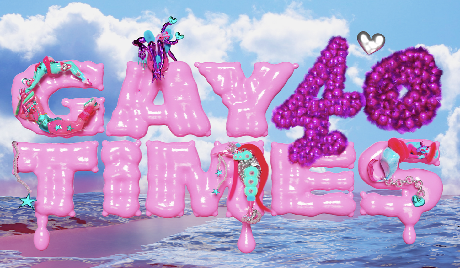
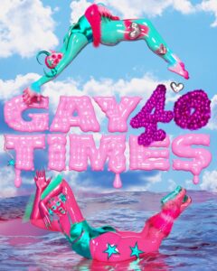
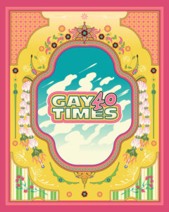
BORA, FRANCE
Currently based in France, multidisciplinary artist BORA (aka Pauline Canavesio) is known for an amorphous practice spanning music, poetry and – most relevant in this instance – 3D and digital design. The artist’s elaborate characters ooze and balloon in bubblegum pinks, deep purples and sky-like cyans. Despite their surreally synthetic aesthetic, there is a fleshy quality to these characters – suggesting that they’re not quite alien but, instead, a maximalist exploration of our post-gender, post-corporeal bodies.
For our fortieth anniversary, BORA brought their shape-shifting creative powers to the GT logo – delivering a bulbous, glossy pink font adorned with crustacean-esque, multicoloured sea creatures, all set against a calming seaside backdrop.
If your piece had a title, what would it be?
It would probably be something like, “Mirror my soul, you liquid star”.
What do the words GAY and TIMES mean to you?
Fluidity, space to explore all the dimensions one can have and getting closer to oneself and others. It should always be gay times.
What kind of art do you want to be creating in forty years?
Art that can be felt, that’s alive, impermanent and shapeshifting in synchronicity with the inner seasons of the heart.
What message do you want to send with your redesign?
Hope and tenderness. I chose water as a symbol because it mirrors, it reflects, it moves constantly in a flow, it is fluid. It always finds its path and can’t be caged. The characters around the logo are little guardians, little souls looking at you saying: ‘We are here, we feel and joy is our revolt’.
What about the queer community inspires your practice?
Our paths and our stories. The desire to embrace and follow our core and create representation. Our vibrant vision and will to exist beyond all the lines.
Follow BORA @boramurmure
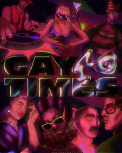
BLACKPOWERBARBIE, NEW YORK CITY
Hailing from Toronto but settled in New York City, blackpowerbarbie (real name Amika Cooper) is an animator and illustrator motivated by a desire to further the representation of Black femmes. Her whimsical, 2D aesthetic encompasses nostalgia, psychedelia and Afro-futrism – and is beautifully and uniquely hers. With clients ranging from brands like Xbox and MTV to musicians like Joy Oladokun and Haviah Mighty, her creative skillset is rich and varied, but a unifying thread is her dedication towards treating her subjects with nuance and compassion.
To mark four decades of GAY TIMES, she transported the logo into a sumptuous queer nightlife scene – recognising the role that LGBTQIA+ bars and clubs have played in our collective history.
If your piece had a title, what would it be?
“We Love The Clurb”.
What do the words GAY and TIMES mean to you?
To me, the word GAY means freedom and authenticity, and TIMES makes me reflect on our current realities, a reflection of whatever is true now.
What kind of art do you want to be creating in forty years?
Something I can’t even begin to dream up now. I would love to keep pushing myself and learning new things, so much so that my 30-year-old self would be surprised about what I end up making at 70-years-old.
What message do you want to send with your redesign?
I think nightlife and music is an impactful safe space for queer folks to find and enjoy community, at least it was for me. It’s a space where we can be ourselves out loud and be inspired by each other.
What about the queer community inspires your practice?
My queer community really helped define and elevate my practice. Beyond providing endless inspiration for my character-driven work, I really came into my own through illustrating and animating projections for live events. I’m thankful for the many DJs, artists and organisers who have put a battery in my back. I’m very fortunate to be surrounded by people who inspire me to reflect their energies back to them in spaces and experiences for us all to enjoy.
Follow blackpowerbarbie @blackpowerbarbie
JER DEE, PHILIPPINES
Living in Metro Manila, visual artist, creative director and DJ Jer Dee creates airy, energetic designs inspired by his Chinese-Filipino heritage. Within his commercial work, the artist has worked with the likes of Nike and Soho House while his passions are rooted in the world of nightlife, where he can be seen spinning behind the decks at queer parties.
To celebrate GT’s fortieth, the multihyphenate has taken us through the looking glass: updating the GAY TIMES masthead via an illustration of a shimmering antique mirror and encouraging us to reflect on our unique history.
If your piece had a title, what would it be?
“The Mirror”.
What do the words GAY and TIMES mean to you?
It means the plight and experiences of queer people through the years – past and present.
What kind of art do you want to be creating in forty years?
I want to be able to create and creative direct beautiful experiences tailored for the queer community. To nurture every single queer person to fruition.
What message do you want to send with your redesign?
That there are many queer talents in Southeast Asia, and it’s SEA’s time to shine and show our magic to the world.
What about the queer community inspires your practice?
The joy that we exude despite trying times. We always find joy in every little thing and I always take that mindset with every piece that I do.
Follow Jer Dee @jer.dee
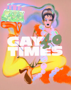
OHNI LISLE, NEW YORK CITY
Currently residing in Brooklyn, illustrator and animator Ohni Lisle conjures up flamboyant, cheeky interpretations of the human form: fabulous personas who look like they belong on a fashion catwalk or a Parisian art gallery. Her compelling work possesses a spontaneous, almost painterly, quality – one that has attracted commissions from Apple, Nike and The New York Times.
Coinciding with GAY TIMES’ fortieth birthday celebrations, she gave our logo the high fashion treatment: balancing a lit birthday cake on their platform heel, Lisle’s flapper-ish character looks fit for a couture week after-party.
If your piece had a title, what would it be?
“40”.
What do the words GAY and TIMES mean to you?
Gay is one of my favourite words. It means merry or homosexual, to me. Times means the energy of now.
What kind of art do you want to be creating in forty years?
Paintings, abstracted paintings of people.
What message do you want to send with your redesign?
I want to make a cheeky nod to the fact that birthdays can be overwhelming.
What about the queer community inspires your practice?
The queer community inspires me endlessly, we are a very creative, exuberant people. I see so much good creative work from queer makers.
Follow Ohni Lisle @ohnilisle
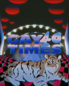
JACK ZHANG, LONDON
Raised in China and now residing in East London, Jack Zhang creates future nostalgic animations infused with the aesthetic traditions of manga. Across both personal and commercial work, the Animation Director plays with themes of sex, queerness and surrealism, all filtered through a retro, VHS lens.
Celebrating GAY TIMES as it hits the big 4-0, he transformed our logo into a message of queer love and solidarity that stands the test of time – depicting two, intertwined hands against a trippy backdrop featuring a tiger, the moon and a geometric, chequered pattern.
If your piece had a title, what would it be?
“Intergalactic Love”. My vision for this piece changed a few times throughout the process, so now I’m just naming it based on whatever I see in the finished piece.
What do the words GAY and TIMES mean to you?
GAY means me and TIMES means 2024.
What kind of art do you want to be creating in forty years?
Psychedelic music videos or animated pornography that melts your brain. I had a conversation with someone the other day and they were at a rave where there was animation playing on the big screen. I really like the idea of doing art and having people dance to it. I love making art that elicits extreme emotions from the audience: be it love, hatred or disgust.
What message do you want to send with your redesign?
That homosexuality is eternal and it’s connected to the universe whether you want to admit it or not.
What about the queer community inspires your practice?
I love the boldness, flamboyance and dazzling glam that’s inherent in this community, it really vibes with my own aesthetic. Sometimes I feel like a sponge that just keeps absorbing, at the same time there’s some chemical reaction brewing internally. When the right moment comes, I release it and drown everyone with it.
Follow Jack Zhang @animate_jack
The post At 40, GAY TIMES gets a facelift: the five artists reimagining our logo appeared first on GAY TIMES.
Go to Source
Author: Megan Wallace